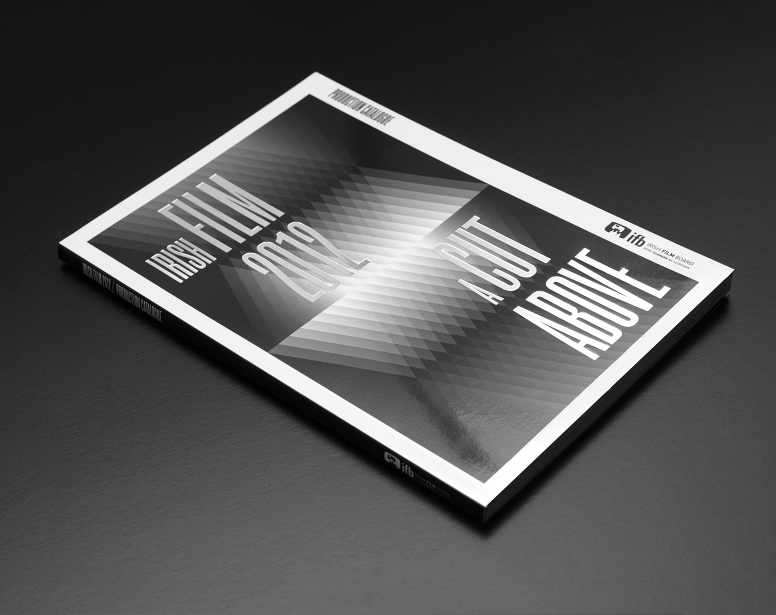
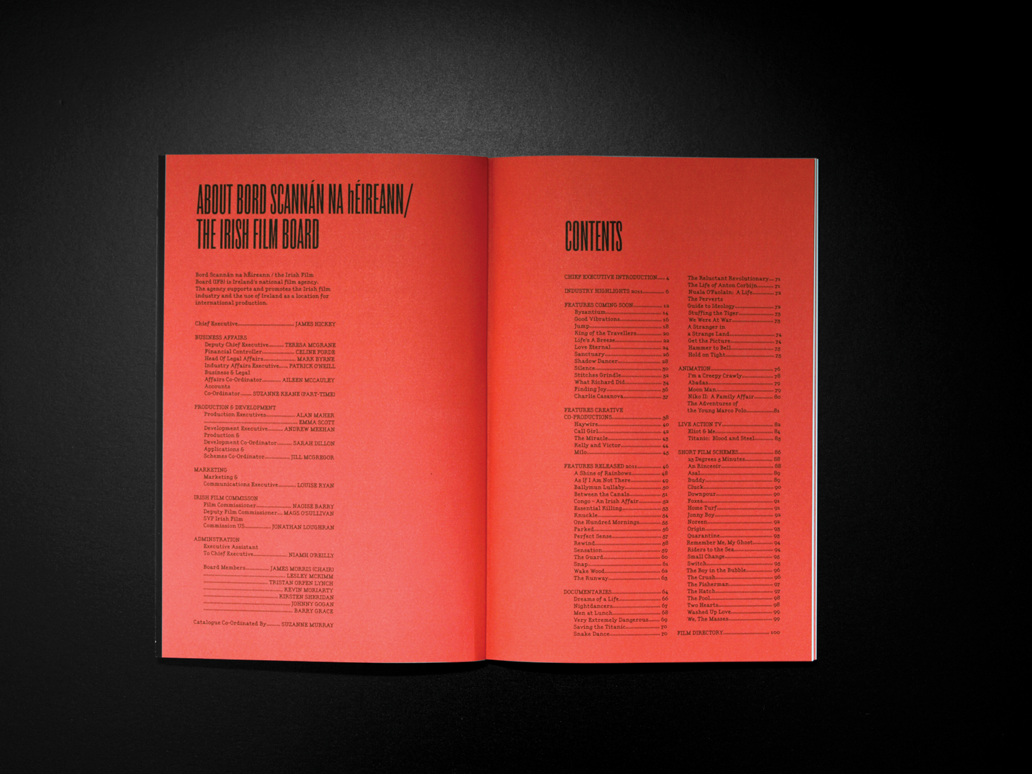
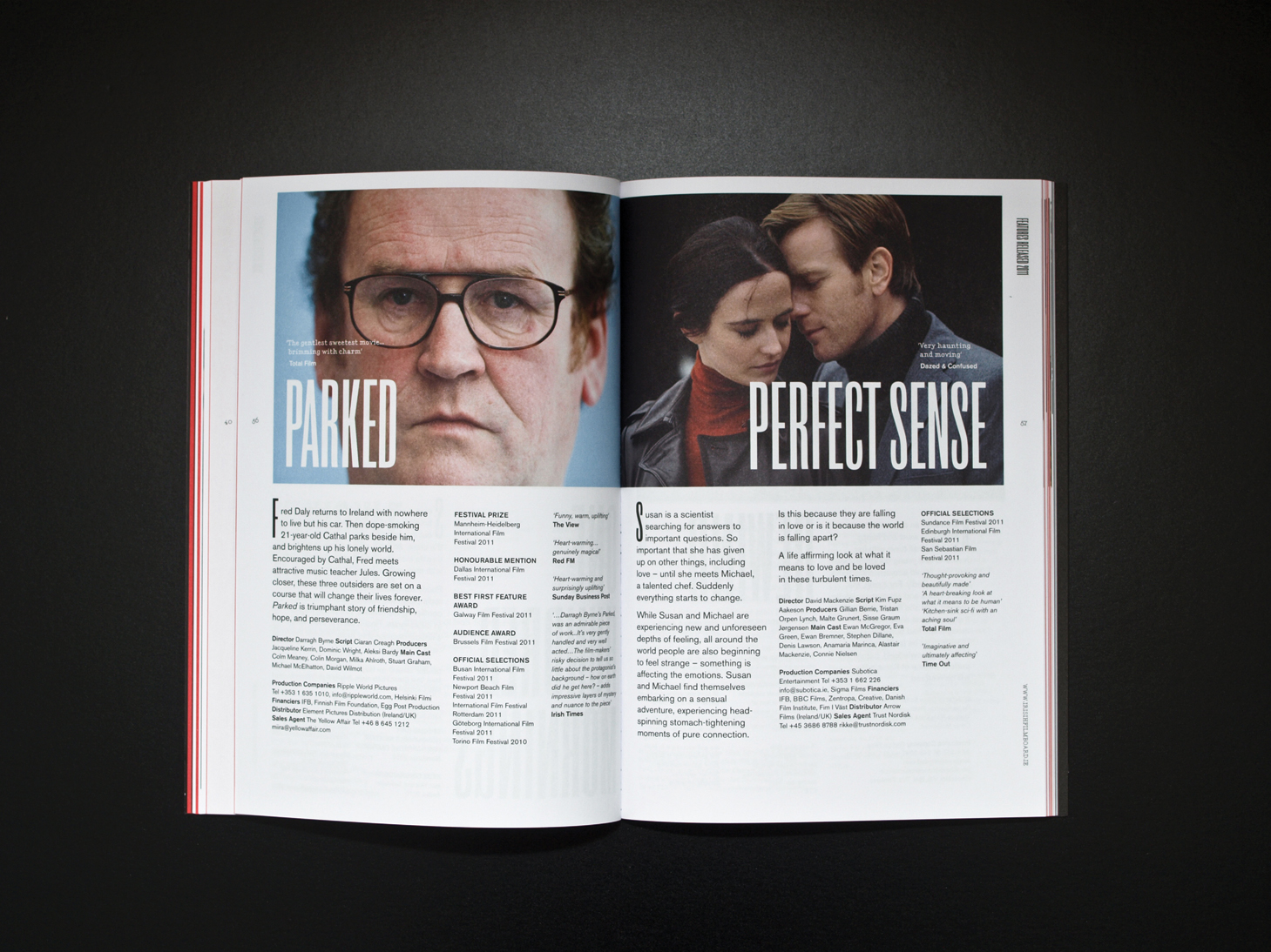
The concept behind this catalogue was three point lighting which is the standard lighting for films. We designed a triangular pattern from this and it became the visual language for the catalogue. The primary typeface was specifically chosen because it is the type used for the credits on film posters. Our intention was to bring back the glamour of the silver screen in an Irish capacity. The idea was adapted for the 2013 catalogue so that it reflected the age of technicolor films.
Designed with Creative Inc


